


While being great for a deep dive into customer behavior data and comparing how different groups act over time, cohort analysis can often seem intimidating. Here’s a short guide on how to master it.
One of the key reasons for the unfavorable status of cohort analysis among marketers is the complex nature of cohort charts. While we know there is valuable information waiting to be discovered in those cells, it’s not immediately obvious where the golden nuggets of insights lie, or what is going on overall.
Nevertheless, the benefits of figuring out how to read them outweigh the challenges. Not only are there some extremely useful data points to be pulled on audience behavior, but cohort analysis is also one of the standard views in Google Analytics.
Moreover, getting to grips with how it works and what it can do for you doesn’t have to be difficult. Once you learn how to interpret the story your data is telling, you’ll be able to extract actionable knowledge on any number of trends, patterns, and habits. Here’s our five-minute guide to getting started.
What is a cohort analysis chart?
If you’re reading this, you’ve probably seen one already - If not, you can check out our step-by-step guide on how to create a cohort analysis chart here for more info. But it’s worth covering the basics of what charts show — and to do that we’ll have to dial back slightly to what makes a cohort. Simply put, a cohort is a specific group of people with a shared characteristic or criteria. This common denominator could be the first product people bought from you, the channel or ad they came to your website from, or their age or home country.

By having this element in common, a cohort analysis chart allows you to compare the behavior and metrics of these different cohorts over time. From this you can find the highest or lowest-performing cohorts and see which factors are impacting that performance.
The cohort chart is where all this information is displayed, and it also usually defines the unifying factor for your audience group within a given time period. Your analysis report can also be configured to display lots of different factors. For example, the number of people revisiting your website in a cohort, or the percentage of people buying a particular product. You can then compare different cohorts alongside each other over time.
What insights can I get from a cohort analysis report?
By grouping people into cohorts, you can analyze and compare a huge range of factors depending on the data you have available, such as buying patterns, conversion trends, or product popularity. You can then use the output of this evaluation to unearth even deeper treasure, including insights into performance across multiple customer segments.
This means cohort analysis is one of the most effective ways for you as a marketer to lead successful experiments. It allows you to run a campaign (in a set timeframe) with different attributes you want to test, such as marketing channel, ad creative design, or a certain product, and compare the results to see which factors were contributing to your performance and which were not.

If that all sounds a little too theoretical, here are a couple of examples of what it could enable you to scope out:
- Whether customers who first read a product review have a higher conversion rate than those who don’t;
- If audiences coming from a specific ad campaign have a lower bounce rate, and any signs of a similar high churn pattern in terms of retention for website users arriving at your site from a specific channel.
How to read a cohort analysis chart?
That’s enough of the theory, let’s explore an actual cohort chart for something that’s especially hot right now: online shopping.
Stage one: mastering the top line
In this example, we are looking at tracking repeat sales in an eCommerce store. The yellow column ‘0’ shows the number of customers who made a first-time purchase each month. The following columns show how many customers from that cohort then made another purchase, and which month they did so. So far, so surprisingly easy.
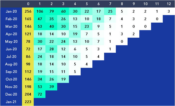
Reading along the top row of data, we can see a straightforward sequence of events. Of the 256 customers who made their first purchase in January 2020, 106 made another purchase the next month, with 70 making a buy two months later, 60 after three months, and so on. From this, it’s not only instantly clear which months were the most bountiful for first-time customers, but also which months performed best when it comes to customer retention.
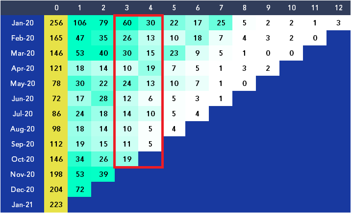
Stage two: taking the downward path
As we read down the columns, things start to get more interesting, and potentially more complicated. But bear with us. In the chart below, there is a big drop in numbers for most months between columns three and four, noticeable by the sudden change in shading between those columns: darker to lighter.
What we can take from this is that the critical time for customer retention is three months after the first purchase. Armed with this knowledge, the eCommerce business can now start to address why this is happening and start rolling out new measures to halt the trend. For instance, it might develop a loyalty campaign around the three-month mark to draw customers back in and ward off the march towards ever-fading attention.
Stage three: climbing the ladder
You can also read the data diagonally. If we look at the July 2020 row, there is a slight hike, and this upward trend continues diagonally right across the chart. The June row sees an increase in additional sales in month two, May sees a jump in month three, April in month four, and it keeps going.
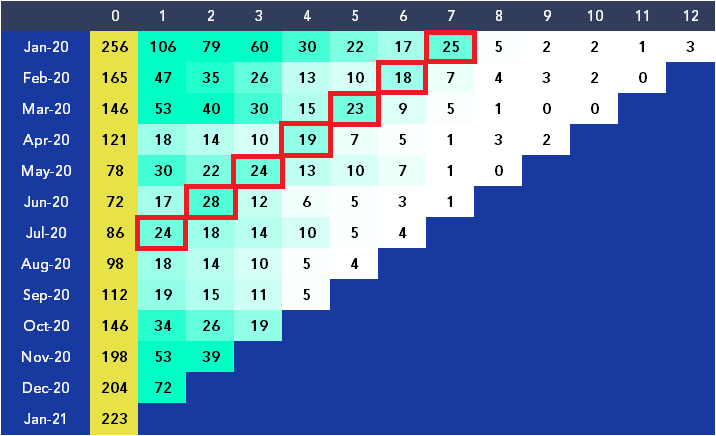
Obviously, something happened in July 2020 to boost sales among returning customers. That might have been an offer or a promotion, in which case the business will know and can see the impact of that sale on customer retention. Or, the trend may be due to some external factor that the business must determine, so they can adjust the strategy and operations to capitalize on similar opportunities. Either way, it provides fuel for further investigation and optimization.
How to compare cohort analysis charts?
OK, so now you know how to read a single cohort analysis chart but comparing two cohort charts is where the magic lies.
Single analysis charts can help marketers spot and dig into the behavioral patterns of certain groups; as in the above chart, often with actions such as purchases. Comparing two charts allows marketers to track the impact of specific variables on the same audiences, or even assess the effectiveness of different approaches on varied audiences. To demonstrate what that might look like in practice, we’ll go through those scenarios in turn.
For scenario one, a marketer might want to determine whether a certain medium has the biggest effect on increasing website visits for a given cohort. The chart for their first analysis may look at audiences and customers coming to the site after receiving an offer via email and in later days across a month, while the second analyzes those served with the same creative as a social media ad. This direct comparison for email and social will show which delivery method wins out.

Or scenario two, a business working across B2B and B2C might want to understand how well messages work for different target audiences. Setting dwell time on the brand site as the engagement metric, they can generate cohort charts for the same advertising message delivered to a B2B and B2C audience, tracking how long those who clicked through stuck around for each return session over a six-month period.
On both counts, what marketers get is an idea of which elements are driving the highest gains and how strategies should be adapted in future.
Limitations of cohort analysis in Google Analytics
As already mentioned, you can use cohort analysis straight out of Google Analytics - but it’s worth noting that there are some limitations.
First, while cohort analysis can (and should) be used for tracking multiple different shared characteristics, Google Analytics can only define cohorts based on the first time a user visits your website. Secondly, tracking retention and returning users to your site is going to start getting much harder with upcoming changes focused on customer privacy.
Thirdly, since cohort data is related to time periods, collecting enough data can be a lengthy process, meaning marketers will have to wait for days, weeks, months and even years before they can gather sufficient data for highly illuminating, but also sometimes belated analysis.
Confusion around cohort analysis is understandable. When combined with the limits of what it can do at speed, it’s not surprising that many marketers have yet to fully take the plunge and find out what it can deliver. But dismissing it as too intricate to be worth the hassle can mean you are missing out on huge, data-driven opportunities that could significantly improve your understanding of audience and customer behavior, and also your marketing effectiveness.
The ultimate verdict on diving into cohort analysis: it takes work, but it’s more than worthwhile.


