

Cohort analysis is a type of data analysis that groups users into segments based on common characteristics shared over time. By grouping people into cohorts, you can analyze and optimize campaigns based on a wide range of factors such as conversion trends, buying patterns, or product popularity — so as you can imagine, it’s a really powerful tool for marketing teams!
In our previous blog explaining what cohort analysis is, we mentioned that getting set up to run cohort analysis can be tricky and intimidating. So, we’ve put together a guide that takes you through how to perform a cohort analysis step-by-step. But there are a few things you’ll need before you can get started!
Step 1: Make sure you have the required data!
The first thing you’ll need is a database you can trust. Data sources specialized in eCommerce like Shopify, Magento or WooCommerce are off-the-shelf solutions which fit the requirements. However, if you have an in-house solution such as your own CRM or database, make sure it contains the following information:
- User-level data: This level of granularity is the cornerstone of cohort analysis, and is represented by having a unique identifier per customer. Customer IDs or email addresses will suffice here. It’s also very important to mention, these are PII (Personal Identifiable Information) data, so make sure you’re complying with both the GDPR guidelines and, if available, specific NDAs with your clients.
- Transaction dates: Such as order dates so that you can assign dates to the orders you’ve processed and attribute them to customers.
- User acquisition dates: Such as first order dates or customer acquisition dates, so that you can mark the start of your customers’ activities, and track them over time. Most of the time this piece of information can be found as part of the orders report or alternatively, as part of a separate report — but you’ll need to merge these together.
If you opt for a behavioral-based cohort analysis, you can extend this information with any descriptive information you’d like to use, e.g. age groups, nationality, acquisition campaign, or discount code used for the first transaction. These in combination with the acquisition date would allow you to generate even more detailed insights. For the scope of this blog post, however, we’ll focus only on acquisition date-based cohort analysis. - One or more report metrics: Often this will be the order value, expressed in your preferred currency. However, you can perform cohort analysis with metrics such as order count or customer numbers. In these two latter cases, you’ll have to perform a count of unique IDs identifying each order or customer. Moreover, you can use other kinds of calculated KPIs such as profit margin (profit/revenue) or customer retention rate.
The above are all must-have requirements. If one of them is missing, you won’t be able to finish your cohort analysis.
As an aside, while it’s technically possible to perform a cohort analysis with aggregated data as well, this provides much less flexibility than user-level data and is, therefore, less valuable. We recommend avoiding data that’s already been aggregated like CPC (Cost Per Click) where possible when performing a cohort analysis, and instead using the more granular user-level data. To find out more about why already aggregated data can be so tricky to work with, you can check out this blog.

Cohort analyses on user-level data helps build a clearer picture of customer behaviour
Step 2: Choose your cohort identifiers and calculate time elapsed
Once all of the above are available, you’ll need to identify:
Cohort identifiers
Cohort identifiers are used for grouping your cohorts based on a certain time window. In other words, you are grouping your users into different groups depending on the specific dates of a particular activity — in this case, the customer acquisition date. This can be different time periods depending on what you are trying to analyze, for example:
- Daily cohort (format YYYY-MM-DD, e.g. 2023-05-17, meaning 17 May 2023) is good for analyzing day-to-day business.
- Weekly cohort (format YYYY-WW, e.g. 2023-20, meaning the 20th calendar week of 2023), used for months-long analysis, and it is the most common time-based format.
- Monthly cohort (format YYYY-MM, e.g. 2023-05, meaning May 2023), is best for year-long developments.
Time elapsed
Time elapsed calculates the time since the acquisition of the customer (or whatever activity you have chosen as your cohort identifier). It is expressed by the formula ((current day) - (acquisition date)) and subsequently:
- Time elapsed in days (recommended format XXX, e.g. 012, meaning 12 days passed).
- Time elapsed in weeks (recommended format XX, e.g. 05, meaning 5 weeks passed).
- Time elapsed in months (recommended format XX, e.g. 07, meaning 7 months passed).
Step 3: Maintaining your cohort analysis
Before jumping into the visuals we still need to make sure our data pipeline is set up for regular processing with the lowest level of manual maintenance possible. Make sure to:
- Automate your updates: Data is scheduled to fetch on a regular basis ensuring the most recent updates are reflected in your analysis.
- Overwrite your data: Use your transaction date column as a criterion to overwrite rows. This will ensure that:
- You’re not overwriting older entries when importing new data.
- You’re not running the risk of creating duplicates.

You can streamline your cohort analysis by automating your updates
All set and done? Great, then you’re finally ready to create your cohort analysis table.
Step 4: Create your cohort analysis table
You’ve prepared the ground for your cohort analysis, now it’s time to build a cohort analysis chart in your BI tool of choice.
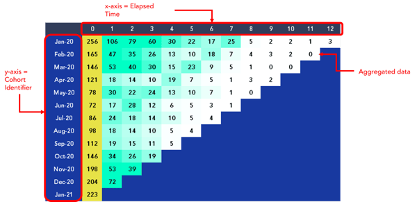
You’ll need to add your cohort identifier — in this case, customer acquisition date, down the Y-axis of the table, and add the time elapsed along the row at the top. From here, you can use the table to aggregate the metric of choice — in this case, order value.
Each cell in this table represents the collective amount that a particular cohort of customers spent in a given month. So, if we take a look at the row for Jan-20, we can see that this cohort of customers who were acquired in January 2020 collectively spent $256 in the month they were acquired, and 7 months later, the same cohort of customers collectively spent $25.
Congratulations, you’ve created your first cohort analysis table!
Ok, what next?
Now your cohort analysis table is complete, and you have a blank canvas from which you can perform further analysis and derive more insights. As food for thought, you can try to:
- Add dimension filters to your dashboard, so that you can slice and dice the table, isolating only particular groups, such as only certain age brackets or campaigns.
- Add cumulations of your cohorts, by summing up their performance over time to understand, from a different perspective, which cohort performed better.
- Add totals per column, showing information about the highest points reached by the cumulations above.
It’s important to mention, these are just a few hints of what you can bring to the table you already have at hand. However, you can also integrate other kinds of data, for instance, socials and advertising spending to calculate the Customer Acquisition Cost (CAC), break-even analysis, or even the customer lifetime value. The sky’s the limit here.
Ok, but what does this table tell me?
A cohort analysis chart gives you excellent insights into how different cohorts behave over time. Once you have built a cohort analysis table, you can read left to right, top to bottom, or even diagonally to reveal trends in customer behavior over time. And things get even more interesting when you start comparing two different cohorts against each other.
Single cohort charts can help you identify and dig into the behavioral patterns of certain groups. But, comparing two charts allows you to track the impact of specific variables on the same audiences, or even assess the effectiveness of different approaches on varied audiences.
To learn more about how to read a cohort analysis chart, check out our blog “How To Read a Cohort Analysis Chart: Best Practice”.

