


Modern marketers often find themselves in an unenviable position, being overwhelmed by data, yet under pressure to make speedy optimization decisions.
If this scenario sounds familiar, mastering the art of data visualization can be invaluable for helping you make faster decisions based on your data.
Data visualization turns your raw data into visual insights, making it easier to keep an eye on performance and spot trends in your data.
The basics of good dashboard design haven’t changed all that much. What has changed is how people now use dashboards. More teams expect to filter, drill down, and explore on their own. Some also expect written summaries or plain-language ways to ask follow-up questions inside the dashboard experience.
In this guide, we’ll look at the key things to consider when creating a marketing dashboard that is clear, useful, and built to support better decisions.
1. Understand your audience
Before you get started creating your data visualizations, it's important that you have a thorough understanding of your target audience and their needs from your data.
Some typical questions you might want to ask include:
- What is the target audience’s level of expertise?
- What does the target audience already know about the data you’re presenting?
- What kind of decisions does your audience need to make based on the data?
- How much time does your audience have to engage with your visualizations?
The answers to these questions can be used to inform the depth, complexity, and types of data visualization needed to best meet your audience’s needs.
For example, senior stakeholders within your business might need a clear, high-level snapshot of marketing performance. The best data visualization technique for this audience might be to include simple, easy-to-understand charts that focus on key KPIs and trends, without getting bogged down in the details.
On the other hand, if you're creating visualizations for the teams responsible for the optimization of different marketing channels, they are likely to need more granular data to guide their campaign adjustments.
The types of data visualization charts you might consider for this audience could present a top-level view first, but allow them to drill down into specific granular metrics if needed.
2. Choose the most effective charts to visualize your data
One of the benefits of modern data visualization platforms is the wide range of charts and graphics they have available to help bring your data to life.
But this can be both a blessing and a curse. One of the common pitfalls of data visualization is using the wrong chart type to display data, which can make your visuals more difficult to interpret and gain insights from.
Choosing the right type of data visualization chart depends on a number of different factors, such as the questions you want to answer, the data you have available, and the needs and expertise of your audience
We’ve got a dedicated article on the different chart types you’re able to use for data visualization if you want a deep dive — but let’s quickly summarize some of the most commonly used visuals:
Line charts
Line charts are a type of data visualization that almost everyone will be familiar with, and they’re great for visualizing and comparing trends in data over time.
Including multiple data sets in a line chart is possible, so it's a great option for comparing data series like daily sales by marketing channel, for example.

Stacked area charts
Stacked area charts show different data sets stacked on top of each other and are a great way to illustrate each data series' contribution to the whole.
In a marketing context, you might use a stacked area chart to generate insights from data by showing the revenue contribution of different product categories over time.
This would allow you to see not only the overall sales trend but also how the product mix is changing.
Column charts
Column charts use vertical bars to represent different values, making them a great type of data visualization chart when you need to compare data series side-by-side.
In a marketing dashboard, a column chart could be used to compare monthly sales figures across different years. This would allow you to easily see patterns and differences in year-on-year performance for each month

Bar charts
Bar charts are similar to column charts but use horizontal instead of vertical bars.
They’re generally a better choice than column charts if you have a larger number of data series to compare. As a general best practice rule, using bar charts over column charts is recommended when there are more than seven data series.
So, if you wanted to compare sales performance across 20 different products in a marketing dashboard, a bar chart would likely be more effective than a column chart.

Scatter plot charts
Scatter plots are used to visualize the relationship between two variables.
One of the best applications for this type of data visualization is to help identify correlations and outliers in your data.
For example, you might use a scatter plot chart to analyze the relationship between marketing spend and sales revenue for different campaigns. This could help you quickly and easily identify which campaigns are most efficient at driving sales relative to their cost.

Bubble charts
Bubble charts are a more advanced variation of scatter plots, where a third variable is represented by the size of the bubble.
Imagine a social media visualization where one axis represents the budget, the other axis represents the number of ad engagements, and the bubble size represents the engagement rate.
This type of data visualization could help identify which campaigns have a high engagement rate relative to their cost and inform optimization decisions for the social media team.

Gauge charts
Gauge charts are a great way to illustrate progress towards a goal or KPI.
They are often used in dashboards and reports to provide a quick, easy-to-understand view of key metrics.
For example, a gauge chart in a marketing dashboard could be used to show the team's progress towards quarterly targets, such as the number of leads generated.

3. Avoid misleading visuals
When you’re creating data visualizations to turn data into insights, it’s important that they accurately and honestly represent your underlying data, without distorting or misrepresenting it.
By just changing the scale on an axis or omitting a data point, it can be easy to inadvertently create visuals that are confusing or misleading.
Misleading visuals can result in a misunderstanding of your data, inaccurate decision-making, and a lack of confidence and trust in your marketing dashboards.
One of the most common culprits is manipulating axes in order to illustrate data in a more favorable light.
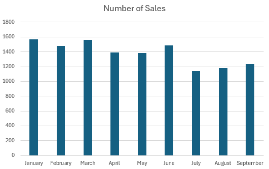
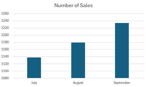
In figure 01 below, we’ve got a full picture of the sales throughout the year, which shows a drop off in sales in July, August, and September compared to the rest of the year.
If you truncate the y-axis and manipulate the x-axis to show only the last 3 months like figure 02, it shows a rosy picture of significant sales growth.
While the data is still technically accurate in figure 02, the impression it gives the user is very different from the longer-term reality.
|
|
|
To help ensure your visuals aren’t misleading, a good data visualization technique is always to use clear, consistent scales and labeling, and not skew or selectively omit data to fit your narrative.
Also, be careful not to fall into traps like mistaking correlation for causation in line charts, and be mindful of how often you use pie charts for comparisons. Although they look nice, they can be quite difficult to analyze!
4. Use color effectively
The use of color is another factor that can significantly impact the effectiveness and clarity of your data visualizations.
When used thoughtfully, color can help make your visuals easier to understand and highlight key insights, which is exactly what you need if you want data visualization to turn data to insights.
A common pitfall to avoid is using different shades of the same color to represent different data series or categories.
While it might initially seem like a good idea to make your dashboard design look consistent, it can make it more challenging for your audience to differentiate between values and series in your charts.
When you’re choosing your color palette, it’s best practice as a data visualization technique to consider accessibility and select colors that are easy to differentiate between for people who may have vision impairments like color blindness.
Another thing to consider when using color is using intuitive associations to illustrate positive and negative trends or metrics.
For example, you might use green to highlight values performing above target and red to highlight values performing below target.
This can make it easier for users to understand the key points on your visualizations at a glance.
5. Prioritize simplicity
A common misstep made in data visualization is to try and showcase the full extent of your data or to try and show off the full capabilities of your chosen visualization platform with a wide range of charts and visuals.
This approach often backfires, making visuals and dashboards more confusing than they need to be.
It’s worth always keeping in mind that the ultimate goal of data visualization techniques is to communicate insights clearly and efficiently to a marketing team that is overwhelmed with data.
So, the priority should be to create simple visualizations that are easy for users to understand, analyze, and act on.
Working with the principle that less is more, try to include only the key metrics and KPIs that are most useful for the marketing team and omit any irrelevant metrics that could serve as a distraction.
It’s also best practice to try and structure any visualization dashboards logically, starting with the top-level information at the top, and moving down into more granular analysis as you move through the dashboard.
This helps ensure that everyone can quickly and easily see the important high-level metrics, with the opportunity for individuals to drill down into more detail if they need to.
6. Enable customization and drill-down
One of the main benefits of using an interactive dashboard over a static report is that users can customize their view and investigate the data further.
Allowing users to tailor the dashboard to their needs can improve engagement and help them find more useful insights.
Designing your dashboard to allow comparisons of channels and date ranges, and accommodating deep dives into top-level metrics, can help each stakeholder explore the data from their own perspective.
This kind of flexibility usually takes more effort upfront, but it often pays off in adoption. It also fits much more closely with how people now expect to work with dashboards. More teams want to answer their own next question rather than wait for a fresh report or ask an analyst to pull another cut of the data.
Some dashboard environments now also support plain-language exploration inside the dashboard itself, so users can ask questions about the data shown on the page without leaving that context. In Adverity’s own dashboard experience, for example, Data Conversations in Dashboards is designed to let users ask questions about the dashboard data while staying within the governance boundaries already set on that dashboard.
7. Add context
You’ve considered the needs of your audience, chosen the right charts and graphs, selected a thoughtful color scheme, and made sure your visuals aren’t overly complicated or misleading.
The final data visualization technique to make sure your dashboards are understood correctly and used to inform marketing decisions is to add context, and an element of storytelling.
Adding text elements like titles, labels, and annotations can guide your audience through the data, highlight key takeaways, and provide additional insights or commentary that explains patterns or trends in your visuals.
Annotations can be particularly useful for explaining circumstances or variables the end user might not know about.
For example, if a competitor's flash sale had an impact on your sales for a day, you can use annotations to explain this so that whoever is viewing the visualization doesn’t spend too much time over-analyzing it.
Beyond these text elements, it's important to provide relevant benchmarks around the data you’re reporting, so users can view it in context.
For example, imagine you’re reporting on March 2024 performance.
Without comparing March 2023 to previous data from January 2024 and February 2024, it’s challenging for the user to understand whether performance is good, bad, or indifferent.
By including relevant comparisons for the data you’re visualizing, it can help users more quickly understand the true strength of performance.
This is also an area where newer dashboard features can help. Written analysis can now sit alongside the visuals rather than being created separately afterwards. Adverity’s AI Insights Widget, for example, can generate summaries, period comparisons, anomaly analysis, and recommendations from selected dashboard data, tailored to different audiences.
That kind of support can make dashboards easier to use, especially for busy stakeholders. It still works best when the dashboard already has a clear structure, sound metrics, and enough context for the analysis to be meaningful.
Final thoughts: Effective data visualizations rely on accurate, high-quality data
If you follow the data visualization techniques listed in this article, you’ll soon be on the path to creating engaging visuals that turn data to insights, and help you make marketing optimization decisions more quickly.
The best marketing dashboards are still built on familiar principles. They are designed for a specific audience, focused on the right KPIs, easy to read, and clear about what the data is saying. However, dashboards are no longer just static reporting pages. More of them are interactive, more of them are used for self-serve exploration, and more of them are being supported by written analysis or plain-language querying inside the dashboard experience. So, now more than ever, the value and usefulness of your data visualizations depend on the quality and accuracy of the data that powers them.
This is where Adverity can help.
As a market-leading integrated data platform tailored for marketers, Adverity helps you connect, transform, standardize, and consolidate your marketing data so it’s ready for inclusion in your data visualizations.
With Adverity, you can:
- Automatically integrate data from over 600 sources
- Ensure data quality through data enrichment and transformation tools
- Create a single source of truth for your marketing data
- Work from real-time data, with data fetches as often as every 15 minutes
By working with Adverity, you can spend less time manually consolidating data and more time focusing on creating visualizations that improve decision-making and drive results.
To learn more about Adverity, book a demo.


