

While Google doesn't appear to be getting tired of implementing more and more features these days, search marketing keeps getting more and more complex.
SEM managers now need to take many dimensions into account and have to sift through an immense list of key performance indicators (KPIs) in their daily work.
This often makes it hard to quickly derive the right insights on a regular basis.
This becomes invariably more difficult when advertising on several search engines with multiple ad accounts and integrating conversions from third-party tools - as a result, dynamic decision-making often gets complicated.
In addition to the increased complexity of their work, campaign managers also struggle to present their findings to non-search marketing experts and expect them to understand every detail.
About a year ago, we implemented Adverity in our agency to ensure that all of our marketing data was available in one central location. The initial goal was to automate our external client reporting, which we had previously done using spreadsheets.
Ultimately, Adverity dashboards have supported us in many other aspects of our work as well. For instance, in our daily campaign handling, in presentations and to perform detailed analyses of specific performance segments.
Over the past year, I've compiled over 300 dashboards in Adverity and have received a lot of client feedback in return. In this blog post, I'd like to share some “visualization hacks” that have helped us overcome many of the problems mentioned above.
By adhering to these standards, we've prevented potential misunderstandings of how data should be interpreted. This has helped us to create search-dashboards that deliver meaningful insights at one glance.
(For more dashboarding tips, check out our article: 4 Golden Rules for Dashboard Best Practice)
1. Only compare real-time data by using relative values.
One thing that we learned pretty quickly: in times of ever-growing demands and expectations, static templates aren‘t sufficient for modern-day data-driven marketers.
People have different needs and each client has their own individual set of goals. This inevitably means that clients will have different opinions surrounding which dimensions should be considered most important.
Normally, we'll build a new dashboard by duplicating an existing one before adapting it to the client’s needs. Crucially, one thing most of our dashboards have in common are KPI-boxes, which appear at the very top of the dashboard. This means the most important KPIs - according to the client’s goal set - are immediately visible to users. All KPIs in these boxes provide the latest data from any given time period until the present time. This data is then compared alongside figures from an earlier time period.
This type of visualization works best with relative values (e.g. conversion rate or ROI). If you open your dashboard on Monday and compare - let’s say - your overall clicks to those of last week, you won’t be able to derive any valuable insights from it since you're comparing a one-day against a seven-day period.
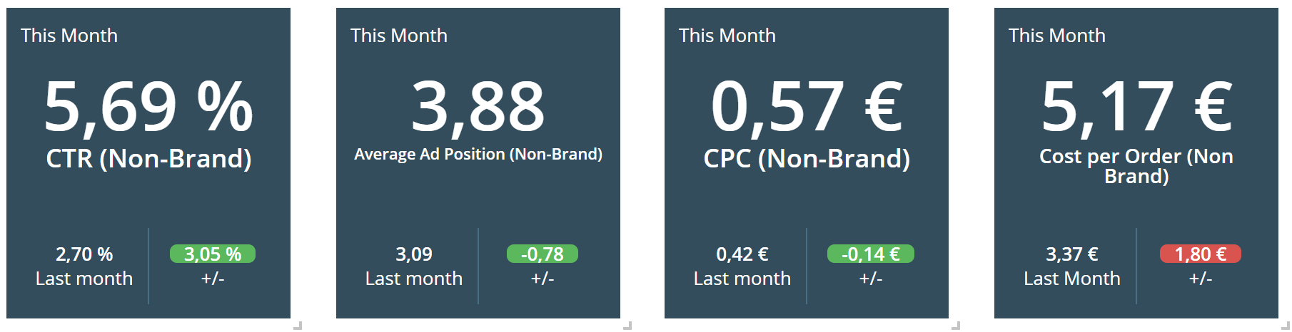
Relative value comparison works with any compared time period. The conditional formatting of the comparative data in the KPI boxes provides a quick snapshot to monitor how the latest data compares against previous figures. By presenting comparative data with conditional formatting in this manner, users can understand new developments in next to no time. This is due to a phenomenon known as the Law of Pragnanz.

2. Split Branded / Non-Branded Keyword KPIs
This is probably nothing new and one of the oldest rules in search advertising, but I still think it might be one of the most important rules of basic segmentation. Splitting these two types of keywords shouldn’t be applied to just your account structure, but also to your dashboards.
Search marketers should define different sets of KPIs to focus on for each type and try to pre-filter each widget according to a specific keyword-type.
Adverity's “quickfilters” provide an excellent outlet for implementing this use-case. Quickfilters basically work like “slicers” in Excel. They allow dashboard users to apply dynamic filters on dimension values across entire dashboards or specific widgets.
Point 6 below provides a short recommendation on how to easily classify ad groups by branded or non-branded keywords within Google Ads.
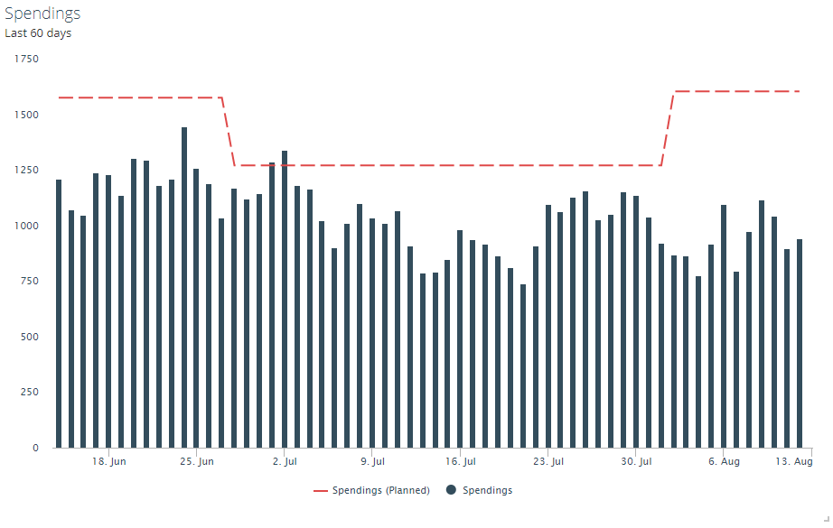
3. Integrate Target Values
If you have the possibility to upload planned values to your search marketing dashboard, it will help you to quickly derive new insights by visualizing these values as part of your widgets.
We use the “Data Import”-Tab in Adverity to do this. As shown in the graph below, it provides you with a clear and informative day-to-day overview of the derivation between your actual and your planned values.
4. Visualize A/B-Tests
With “campaign experiments”, Google Ads provides the possibility of performing A/B split tests on your search campaigns. It’s always a good idea to visualize these tests in a dashboard as well.
If you’re implementing an A/B-test for multiple campaigns or testing across multiple accounts, this is particularly helpful since Google Ads doesn’t provide an easy outlet for analyzing the aggregated test results.
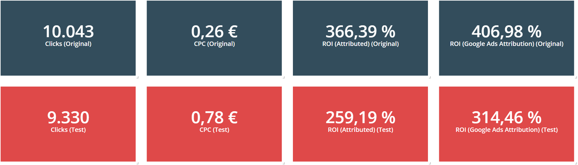
The standard view of A/B-testing results only shows the results for one campaign.
Google Ads automatically creates a new campaign for each new test. Using this in your data integration tool (e.g. Adverity Datatap) is very straightforward - allowing you to segment data by a testing and an original group.
Tip: If you are using a third-party conversion tracking tool that offers you the possibility to split your conversion-data by campaign name, you can integrate this data in your A/B-testing dashboard as well. This will allow you to match attributed conversions to your A/B-testing groups and will transform your search-dashboard into an almighty tool to monitor and analyze split tests.

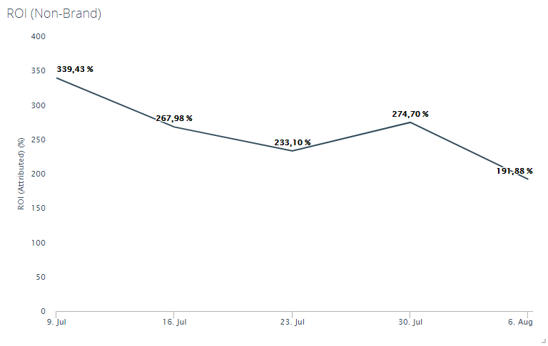
5. Compare different attribution models
If you’re using a dynamic multi-channel attribution model (which you should), you’re probably interested in how this model influences the performance of your search campaigns, compared to - let’s say - a last-click model.
This widget below shows you three ROIs of different attribution models:
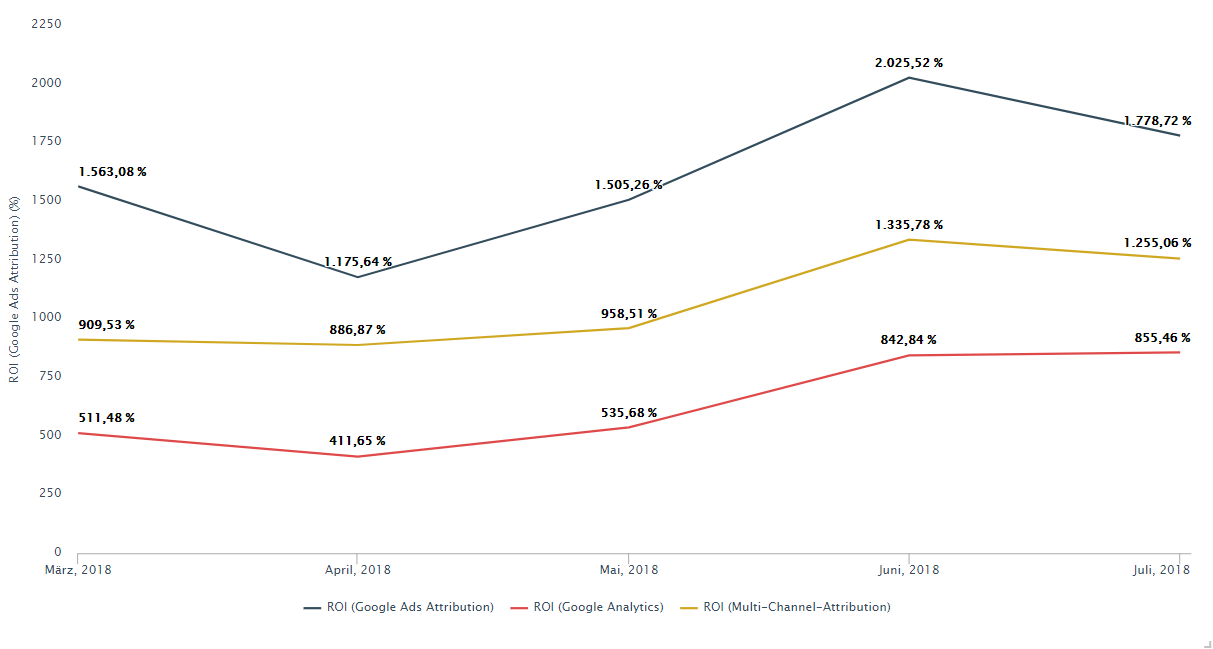
After activating new marketing channels, this chart will only become even more engaging. It will allow you to monitor how these newly activated channels are affecting other channels and their attributed conversion values.
Tip:
When visualizing an A/B-test on different Google Ads bid strategies, it’s interesting to observe how bid strategies affect the conversion metrics of different attribution models. Google Ads bid strategies normally intend to optimize bids towards conversions, as measured by the Google Ads Conversion Pixel.
With a wide array of powerful visualization options, Adverity dashboards provide the best solution for assessing the impact different bid strategies have on attributed revenue.
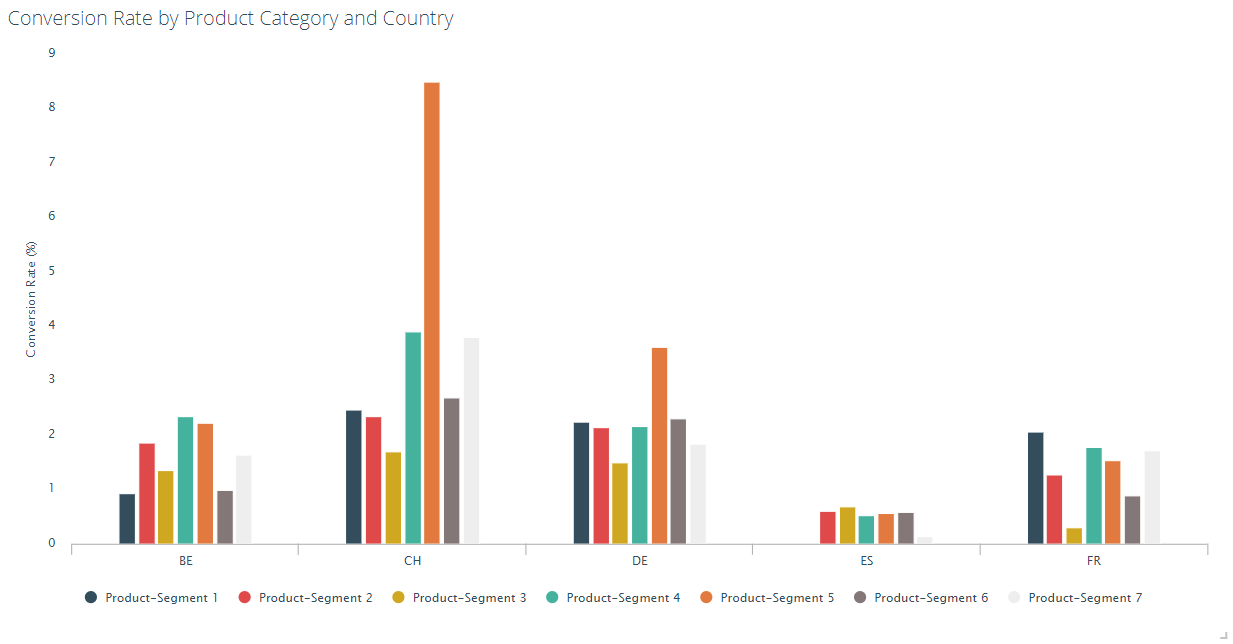
6. Segment your Data by using Google Ads‘ Labels
The most common method of segmenting raw data is to extract different information from existing fields, e.g. “campaign” or “ad group”.
However, this is not always a straightforward process: campaign names may change, clients may demand specific naming conventions or you may decide to segment your data according to a newly implemented dimension and don’t wish to rename all of your campaigns.
Fortunately, Google Ads provides users with a basic functionality called 'Labels'. These provide a more flexible method of segmentation. By defining a naming convention for labels used for segmentation in Adverity, you can effortlessly label your campaigns according to your specified guidelines, all while your campaign names remain the same.
The visualization below demonstrates how data can be segmented by keywords of specific product categories and targeted countries.
Conclusion
Whether you’re visualizing data for large corporations or small businesses, you should always aim to tell a short story with your data - keep it simple, easy to understand, and concise. The ideal search marketing dashboard should not only provide a useful update to your clients but also deliver insights to you as the campaign manager. In turn, you should use these new insights as a justification to implement changes that will improve performance.
The original author of this article is a digital marketing consultant and SEM expert at Adverity client, Dreifive.

