

You might have noticed that our website looks a bit different. Why? Well, for the first time since our launch in 2015, we’ve had a significant brand overhaul. We’ll go into more detail about the changes, so read on!
What’s changed?
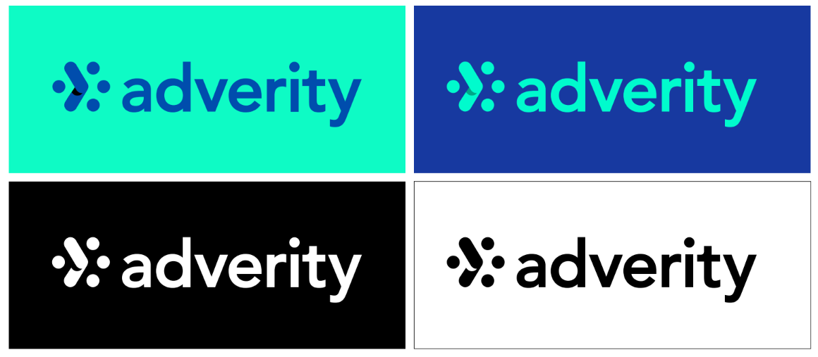
The short answer? We’ve changed everything. Our logo, our website, our color palette, our fonts, and everything in between.
Check out our new logo and brand colors here:
Why did we do it?
Over the past six years our industry and our customers, and the challenges they face, have changed significantly. And that means we’ve had to change too, offering an increasingly more sophisticated solution to meet these challenges.
Our new look is a reflection of this evolution.
“We’ve come a long way and evolved so much in such a short space of time, it became obvious that we needed a new look to reflect the company that we’ve become. I’m hugely excited by our new brand. It's a new look that truly reflects the bold steps we are taking as a company and as a solution. “
Alexander Igelsbock, CEO, Adverity
What’s the idea behind the new logo?
Our new logo represents the concept of “out of many comes one”. It’s a reflection of how crucial it is for businesses to build a single source of truth from all their different data sources, which is precisely what our platform is designed to do.
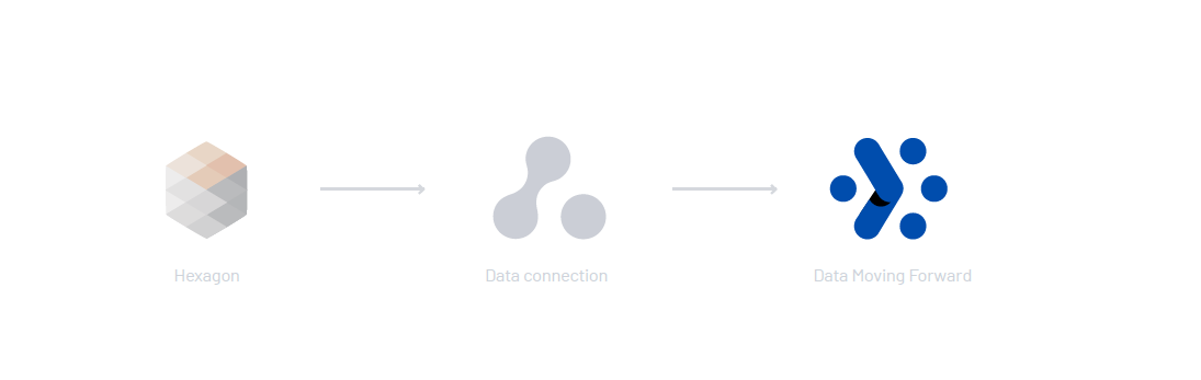
The brandmark is a nod to our old hexagon icon, using a dot as each point on the hexagon. The single dots represent individual sources of data with the lines between them symbolizing the integration of that data.
Turning the hexagon on its side allows us to incorporate our forward-facing arrow, to symbolize progress.
“The design and evolution of the Adverity identity reflect the way in which consumers interact with data. It is not about just standing out anymore it is about everything being connected, which is what is reflected in our color schemes and visuals”
Harriet Durnford-Smith, CMO, Adverity
As for our new colors, which you can check out below, these were carefully chosen to celebrate a bright, diverse, modern lifestyle.

“We are really excited to share the new Adverity look and identity. It reflects in many ways our continued commitment to customer centricity, clarity of focus and, consequently, ease of use,” says Christina Schlesinger, CCO at Adverity.
“Building on our rich experiences and the feedback from our engaged and data-savvy customers, we are keen to share all of the updates throughout 2023. These updates will make complex tasks even easier for any team that runs on data and help generate more consistency and value from their data.”
What’s in store for Adverity in 2023?
Importantly, these changes are only the start of many new features and offerings you can expect to see in 2023. Keep an eye out for future announcements as we continue to deliver the very best-in-class integrated data platform that empowers our customers to transform their data into true value.
“2023 is going to be a huge year for Adverity. Our new visual identity is just the first step in a multitude of exciting updates and new features we’ll be adding throughout the year. We can’t wait to share these with the market as we expand our best-in-class offerings. “
Martin Brunthaler, CTO, Adverity

