Login

Check out our new AI-powered transformation tool!

Take a tour
Book a demo

Book a demo

Download PDF
SaaS marketers. News flash: you’re not in the apps game. Your software engineers might be, but not you.

No, you’re in the people game. But people are complex. Their preferences, backgrounds, habits and behavior all vary massively. You need clear insights that enable you to understand your customers better. Advanced marketing analytics can provide these.

Meet your new friends: data integration. Data visualization. And augmented analytics. They have the power to make you into a world-class marketer. The secret is to develop a sophisticated reporting dashboard based on these technologies. A dashboard that drives your actions by unifying, then intelligently analyzing a wide variety of data sources. And not just marketing ones. The result: better ROI, higher revenues, successful campaigns, and a superior customer experience.

Step one

Focusing In On Data

Modern data-driven dashboards give you a window onto a detailed data landscape. One that includes marketing assets such as written content, images and videos. But also less tangible assets like customer loyalty, brand recognition and reputation. Pretty neat, eh?
We must move from numbers keeping score to numbers that drive better actions.
david-walmsley
David Walmsley

Editor-in-Chief at The Globe and Mail

You can track these data through:


metrics

Metrics

Numerical business measures

kpis

KPIs

Metrics used to measure business targets and outcomes

Here’s the great thing. Visualization dashboards let you follow an unlimited number of different metrics and KPIs. It’s up to you what you track. The main question to ask is why you want to track it. Maybe you want to optimize your ad spend.

Or you might want to improve the performance of an email campaign. Or work out how many customers you’re losing through churn. Perhaps you need to observe click volumes in an A/B Google Ads test.

Adverity-2023-Illustration_WelcomeAboard

Here are some key data that SaaS marketers should aim to measure:


website-data

Website Data

Website-related data can be a great indicator of customer interest and engagement. Things like unique website visits, or conversions and goal completions for newsletter signups or demo requests.

email-campaign

Email Campaigns

Data that will help you track the success of your email campaigns includes email open rates, bounce rates and unsubscribes.

campaign-performance

Campaign Performance

You can track the success or failure of your marketing campaigns by measuring page impressions, clickthrough rates, social shares and reach.

marketing-spend

Marketing Spend

Cost per click, return on ad spend, click through rate and cost per conversion of data-centric measurements – these all tell you how effective your marketing spend is.

Step two

Preparing Your Dashboard

The next step is to organize your data structure and naming conventions. You want to make your dashboard as useful as possible when it comes to reporting on data.

For example, the best way to develop your UTM structure is to look at your marketing funnel. By assessing which assets are top of funnel (awareness), middle of funnel (evaluation) or bottom of funnel (purchase), you can set effective UTM tags. These parameters will enable you to track and visualize your marketing or promotional efforts more effectively on the dashboard.

Adverity-2023-Illustration-inverted_TakeTheWeight 1

On a more granular level, creating asset names can be a repetitive and time-pressured task. Errors can creep into naming conventions. Adverity has a Smart Naming Convention feature that will help. The module applies AI tech to understand a naming convention, highlight any discrepancies and suggest logical rules to categorize name parts.

So, by thinking carefully about data structure and naming conventions you can make your dashboard metrics and KPIs accurate and useful.

Step three

Marketing goals and KPIs

Knowing what you want to measure is vitally important. Here are 6 core SaaS metrics that affect the three commercial pillars of sales, marketing and customer success. By tracking a good spread of indicators, you can make improvements across the board.

6 core KPIs affecting sales, marketing and customer success

Customer Acquisition Cost (CAC)

CAC represents the true cost of gaining a new service subscriber. It includes money spent on sales, marketing, advertising and commission.


Customer Lifetime Value (CLTV)

CLTV is a sales-related metric that tracks the average amount of money your customers pay during their relationship with your company.


Total Marketing Spend

Well worth knowing. This KPI will indicate if your marketing campaigns and ad accounts are on, under or over budget. Very important.


Cost per Conversion (CPC)

CPC is ad spend divided by the number of conversions it generates. Data visualization can quickly show you which campaigns are financially on track.


Monthly Recurring Revenue (MRR)

MRR aggregates all revenue the business receives from paying customers each period, regardless of pricing plans and billing cycles.


Customer Retention Rate

This designates the percentage of customers the business has retained over a given period. You’ll want to watch this one closely.

formula-collage
Step four

Integrating the Data Behind the Dashboard

Now for some nuts and bolts. Successful data visualization relies on great data integration and transformation: two vital technology processes that are also known as ETL (extract, transform and load). Data integration opens up data silos and assembles data from multiple sources. It works together with transformation to create a ‘clean’ and unified ‘data stack’.

Integration

So, for example, Adverity’s automated data integration technology can collect data from virtually anywhere. It uses data connectors and API-like connectors to process any type of data or format. Data could be provided in structured spreadsheets, unstructured and complex Excel files, .json or .xml files, among many others.


Transformation

Once integrated, the Adverity platform applies its powerful transformation engine to the data to clean, normalize and unify it. It joins data from different sources, strips out the formats, enriches it with additional info, and applies rules to particular data segments to make them easier for analysts to handle. As part of this process the engine will fix errors, fill in missing information, and eliminate duplicate entries.


A Clean Stack

The advantages of having a clean data stack are immense. Particularly when it comes to data visualization. The perfect SaaS dashboard should give SaaS and technology business marketers exactly the information they need to discover actionable trends, patterns, anomalies and opportunities, and make real-time decisions. This all depends upon having trustworthy data.

 
Step five

Building Bold & Beautiful Dashboards

Data visualization makes information beautiful. But it’s much more than that. Visualization matters because it drives actionable insights, using real-time graphics, charts and graphs.

With it you can see, at a glance, when demand for a specific app feature spiked. Or the point at which customers churned. Or when ad revenues exceeded expectations. This is all valuable intelligence.

Here are some pointers on how to build beautiful and effective dashboards.

Tracking Customer Behaviors

If you can understand your customers, you can improve the customer experience. But you need to look closely at customer behavior. Metrics and KPIs can be of practical assistance here, particularly in tracking engagement.

  • So, for example, it’s important to track and analyze website activity by measuring things like visitor numbers, unique visitors, clicks, bounce rates, signups and downloads.
  • Metrics can also tell you how long customers stay on your site, or on specific web pages, indicating which content is attracting people. You can apply marketing analytics to all this data to increase conversions and improve the online customer experience.
  • Another useful customer experience metric that SaaS businesses track is Net Promoter Score (NPS). This helps gauge the health of your customer relationships. It asks customers to rate, on a 1-10 scale, the likelihood they would recommend the company or its services.

Dashboards are also invaluable in driving profitability. Here are 3 ways they can help do this.

Customer Acquisition Cost (CAC)

CAC represents the true cost of gaining a new service subscriber. It includes money spent on sales, marketing, advertising and commission.


Customer Lifetime Value (CLTV)

CLTV is a sales-related metric that tracks the average amount of money your customers pay during their relationship with your company.


Total Marketing Spend

Well worth knowing. This KPI will indicate if your marketing campaigns and ad accounts are on, under or over budget. Very important.


Cost per Conversion (CPC)

CPC is ad spend divided by the number of conversions it generates. Data visualization can quickly show you which campaigns are financially on track.


Monthly Recurring Revenue (MRR)

MRR aggregates all revenue the business receives from paying customers each period, regardless of pricing plans and billing cycles.


Customer Retention Rate

This designates the percentage of customers the business has retained over a given period. You’ll want to watch this one closely.

Adverity-2023-Illustration-inverted_SuperBoost 2

Visualization charts

When it comes to visualizing your data, there are so many options. Particularly with a versatile platform like Adverity. There are many different types of interactive charts to choose from, to show your data off in the best way, especially when you use color effectively.

  1. Geometric shapes include: pie charts, pies with drill-down sections, and donut charts that can represent subsets of data. Also, pyramid charts are perfect for visualizing quartiles in colored layers.
  2. Text-based charts can show more data on a single page. These include information tables, or more colorful heatmaps that highlight regions, seasons or demographics.
  3. Data point graphics, such as KPI boxes, can display a single figure very clearly. And a chart with several data points can compare the same KPI on different months.
  4. Bar and line charts are popular visualizations. Among these are linear bar charts, vertical charts, line charts, and grouped bar charts. An appealing alternative is the bullet graph. These can be very effective when used with bright colors.
  5. Lastly, there are all sorts of imaginative graphical charts. From the 2D color-rich geo-map to the scatterplot graph, bubble chart or calendar heatmap, the sky’s the limit when it comes to attractive visuals. But remember: with all of these, the aim is to make data easy to consume and act on.

Smart marketing analytics with Adverity

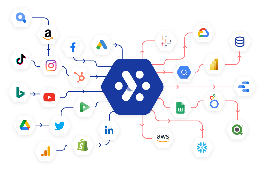
Behind any great dashboard is great data. Through automating data integration from hundreds of sources, our vendor-agnostic platform delivers a single view of marketing performance across your business. And with the help of the sorts of powerful data integrations illustrated in this playbook, Adverity creates tangible business impact from your marketing activities.

Data-connectors-horisontal-arrows

Cars.com

A leader in the automatic classified business, cars.com chose to implement Adverity to completely eliminate manual data processing, centralize disparate data sources and scale business performance through enhanced intelligence.

The business reduced its data wrangling times from 160 to 5 hours each week. They also achieved true return on ad spend in their campaigns for the first time ever.

Learn more

cars.com-logo-1
Because of the data availability that Adverity has made possible, we are now able to calculate true return on ad spend, not in the ad platform, but through the actual business. And the potential of this is enormous.
alex-holt
Alexander Holt

Manager of Data Enablement, cars.com

Vodafone

By using Adverity’s platform, Vodafone transformed its campaign data reporting and reduced wasted time by 75%.

The company automated data integration across multiple CRM systems and data stores, and implemented secure and tailored data access for different levels of stakeholders.

Learn more

logo-client-vodafone
With Adverity I was finally able to transition to generating analysis that offers more value to our stakeholders and strengthens our strategies and decisions. [Adverity] gave us time-savings, more control and rapid results.

emiliano-bozzi-vodafone
Emiliano Bozzi

Digital Marketing & Performance Data Analyst at Vodafone Italy

Book a live demo

SaaS marketers! We can show you how to build a successful dashboard that showcases your sales, CRM, marketing and client success data.

Book a demo